From Concept to Cohesion: A Confident New Identity for Snug
Snug Services Group approached oodle with a clear goal, create a professional brand identity that would feel confident, contemporary, and ready for growth. The business offers property and facilities services with a focus on warmth, efficiency and trust – qualities that needed to come through in their new look and feel.
Our process kicked off with a collaborative design stage, where we presented two initial directions: one based on the client’s original idea, and one developed from our own creative take. From there, we refined the preferred concept over a second round, showcasing three evolved design variations that helped bring the brand into sharper focus.
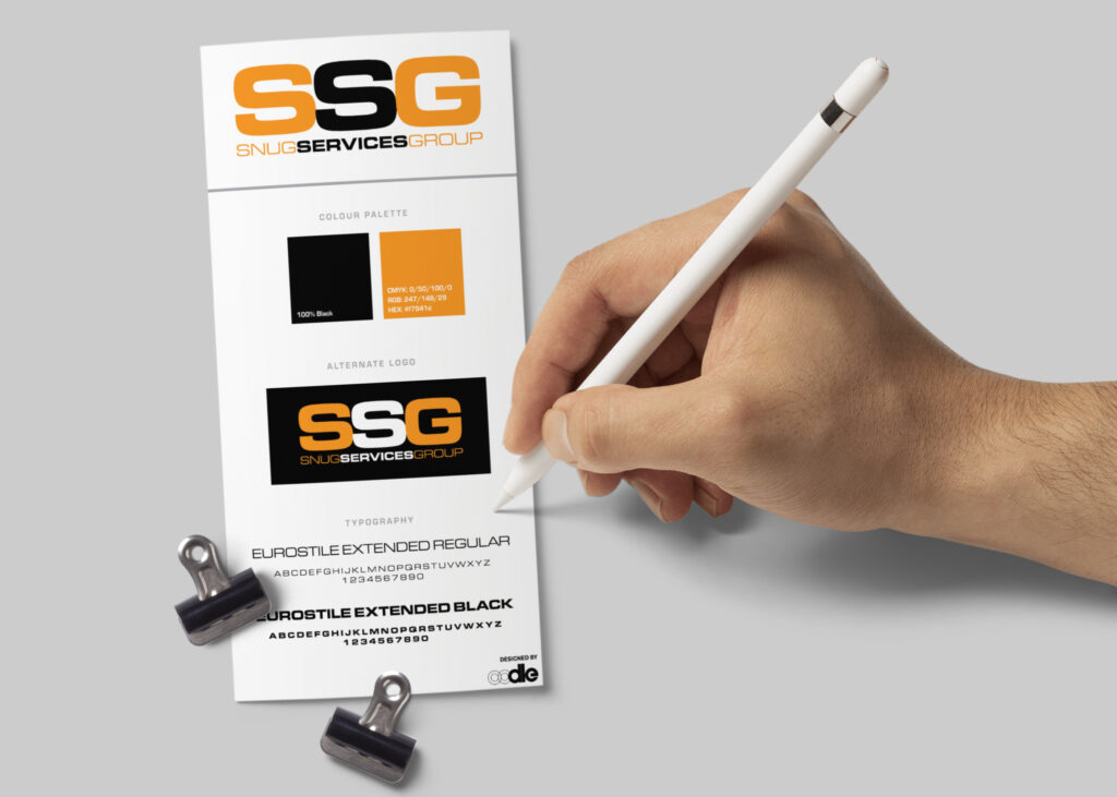
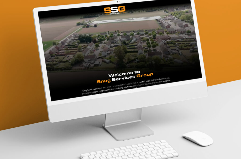
The result is a bold new brand kit for Snug, complete with primary and secondary logos, an icon that scales beautifully across social channels, and a carefully considered colour palette that balances professionalism with approachability. We also created email stationery templates and designed a clean, conversion-friendly website landing page to support the brand’s digital debut.
Snug now has a cohesive visual identity that works seamlessly across physical and digital touchpoints—setting the stage for their next chapter and helping them stand out in a competitive space. Whether it’s email correspondence or online visibility, every interaction with the Snug brand now reinforces their values and personality.
Need to wrap your business in a smart new identity? Let’s talk.

