Refining a Brand with Sophistication and Style
PM Equestrian approached oodle looking for a refined update to their existing brand. While their olfactory identity had served them for years, it no longer felt representative of the high-end products and clientele they were attracting. The brief was clear: create a visual identity that felt premium, cohesive, and aligned with the quality of the Antares saddlery products they distribute.
A Clear Direction with Prestige in Mind
During the initial briefing session, we discussed brands that resonated with their target market – names like Bentley, Canada Goose and Porsche came up, setting the tone for a clean, elevated aesthetic. There was also a desire to maintain a visual link to Antares, their core supplier, particularly through the use of blue in the colour palette.
The existing identity lacked consistency across platforms, with varying uses of typefaces, icons and colour. We identified this as a key area for improvement, particularly for digital marketing and social media. A new brand system needed to work as well on embroidered team wear as it did in a compact social profile image or trade event banner.
Design Evolution: Typography, Colour, and Symbolism
After exploring multiple directions, the final concept combined a minimalist sans serif typeface with a gold accent, lifted from another initial concept the client was particularly drawn to. This subtle gold offered the perfect complement to the Antares-inspired blue, striking a balance between heritage and individuality.
We introduced a clean, modern silhouette icon that could be adapted across platforms, inspired by the original suggestion of a horseshoe or horse’s head, but reimagined to feel refined and ownable. The icon now acts as a strong standalone mark, used on clothing, print materials and social assets.
Building Brand Consistency Across Touchpoints
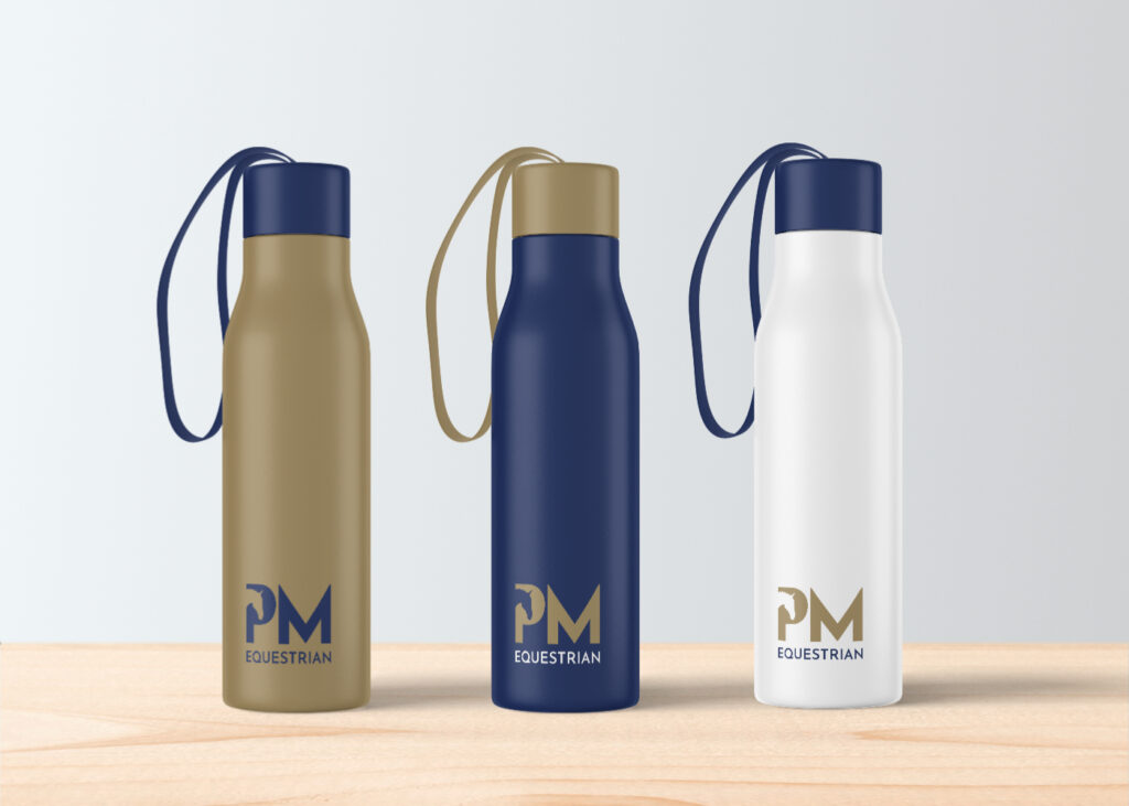
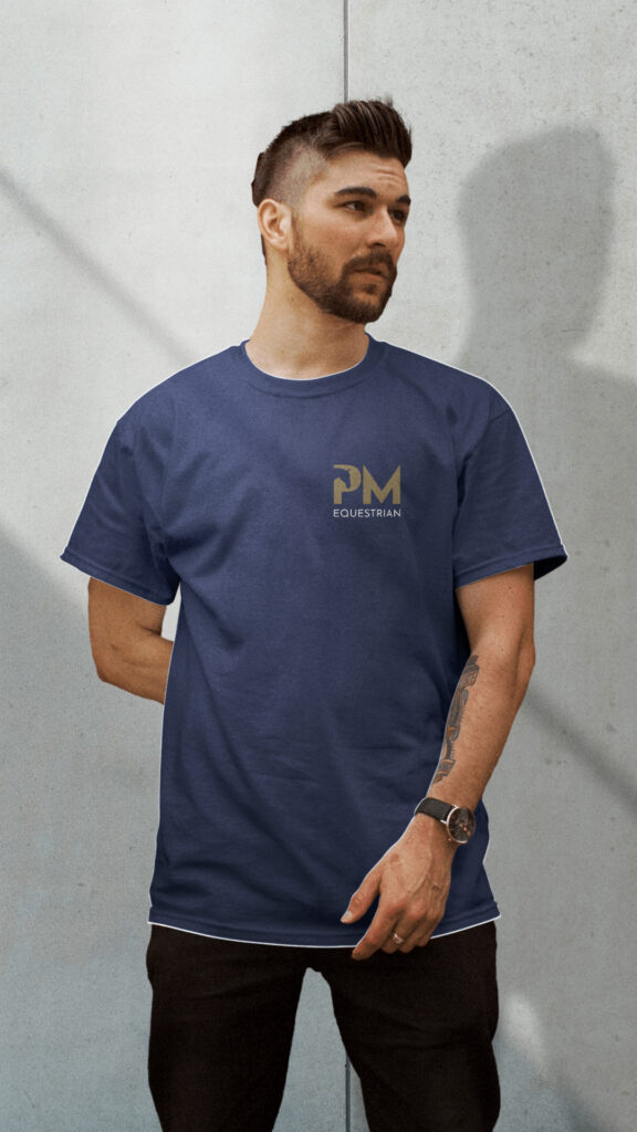
Beyond logo and icon development, we produced brand guidelines covering colour, font usage, social post templates and merchandise mockups. The refined identity brings harmony to PM Equestrian’s communications, ensuring every point of contact, from Instagram stories to saddle tags, reflects their professionalism and high standards.
Before & After
Previously, the brand used multiple blue tones and inconsistent serif fonts, giving an impression that varied depending on the context. The refresh has brought clarity and cohesion to the identity, making it instantly recognisable across all channels while better appealing to their premium market.
Client Feedback & Outcomes
The response from PM Equestrian was overwhelmingly positive. They felt the final brand direction hit the mark, sophisticated yet approachable, modern yet rooted in equestrian tradition. The gold and blue combination, in particular, struck the right tone for their audience and stood out against competitors on the event circuit and in digital spaces.

